

Isaac Physics launched in 2014, a University of Cambridge initiative giving students free physics resources built around problem solving rather than fact recall. It grew to more than 342,000 registered students by 2021 and passed its two hundred millionth question attempt in 2025, across over three thousand UK schools.
Eleven years after its launch, the site felt dated and the scope had outgrown the brand; Physics had extended into Maths, Chemistry and Biology. The site’s positioning no longer signalled its broader value, and its navigation devices and page templates could no longer provide clear and intuitive user journeys. The University needed a fundamental transformation of a platform in active daily use, without disrupting the teachers and students who relied on it.
This case study covers the work I owned, from discovery through to specification and handoff, and focuses on the quality of the thinking and some of the key decisions made rather than post-launch metrics, which fell outside our engagement. This project was undertaken in my role as Principal UX Consultant at Cambridge Agency Group.
Building a shared understanding of the project context and objectives
Following a series of initial briefing workshops, I defined a short set of seven key project objectives covering the platform experience and the commercial goals, to ensure that we had an objective test for the later design thinking. I also documented the different user types, and their main activities, needs and contexts; these didn’t need to be full personas or complex user stories, just a series of short statements to reflect my understanding back to the client.
I also arranged a technical briefing and CMS demo by the client’s engineering team. The new solution had to dovetail with the existing platform, with a shared database and infrastructure, so any changes had to be evaluated for technical impact throughout; having a good relationship with the engineers and an early understanding of the constraints was key to minimising any potential friction later on.
I had no direct access to users during the project, other than some light-touch in-person guerrilla research with students that had been done before I joined the project; instead, I relied on the client team’s expert knowledge of the user base.
Documenting the current state to inform initial high-level recommendations
The existing platform had evolved organically, in terms of features, content and underlying technology, over more than a decade. In that time, solving short-term needs had resulted in a series of somewhat clumsy workarounds and compromises.
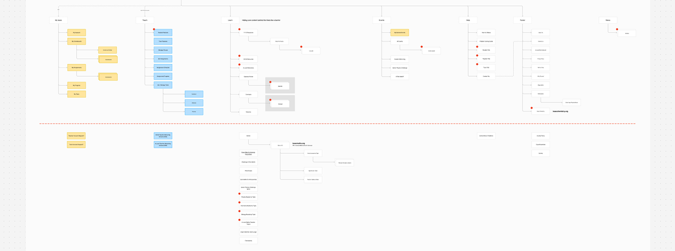
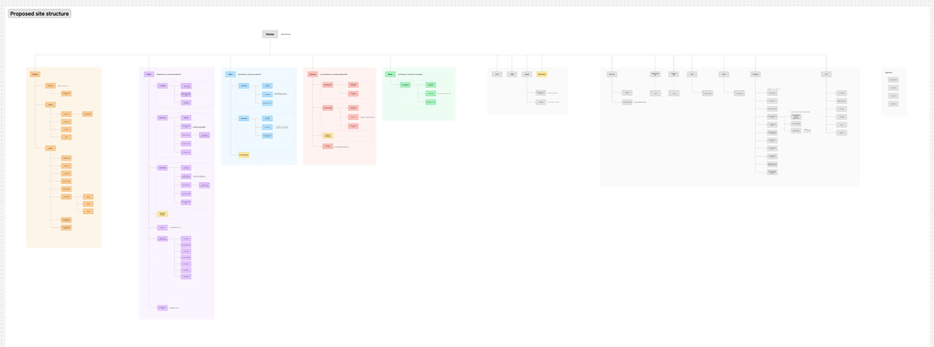
I completed a full site audit and information architecture review, focusing on structure, labelling, navigation and wayfinding, and interaction. Initially, I mapped the site manually to experience it as a user, and then compared that with a list of live URLs provided by the engineering team, revealing many orphan pages or pages only navigable via inline links buried in content paragraphs.
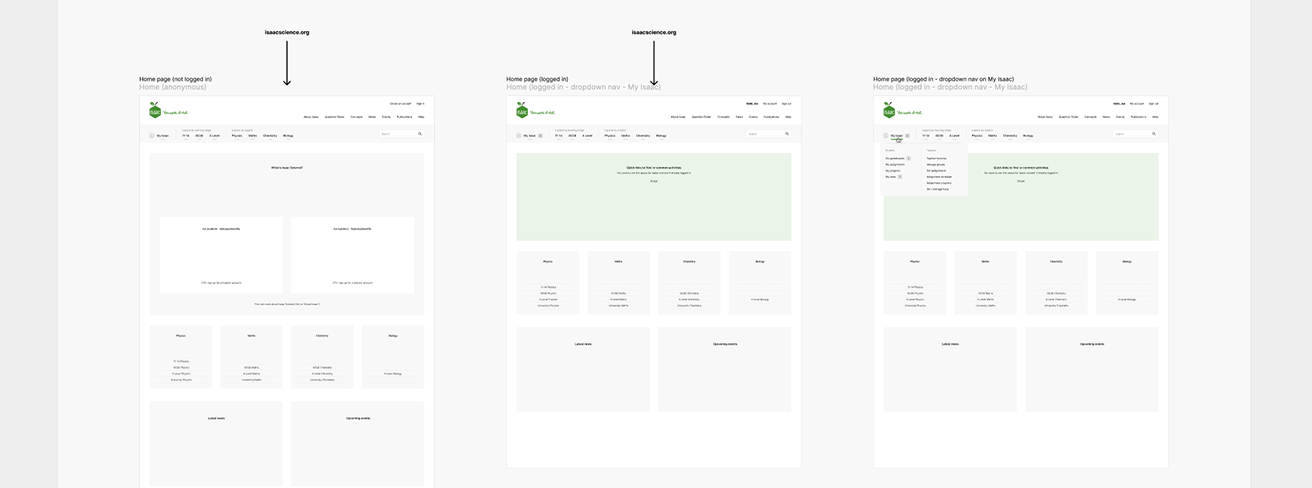
Following an initial round of UX thinking, I presented a series of high-level observations and recommendations, accompanied by low-fidelity sketches to illustrate the ideas and provide a starting point for discussion. Getting visual ideas in front of the client this early was a deliberate call, and one a purist might say comes too soon, but given how invested the client was in the existing platform, I wanted to provide something they could react to: something visual that showed them how it might evolve without hardening the solution too early.
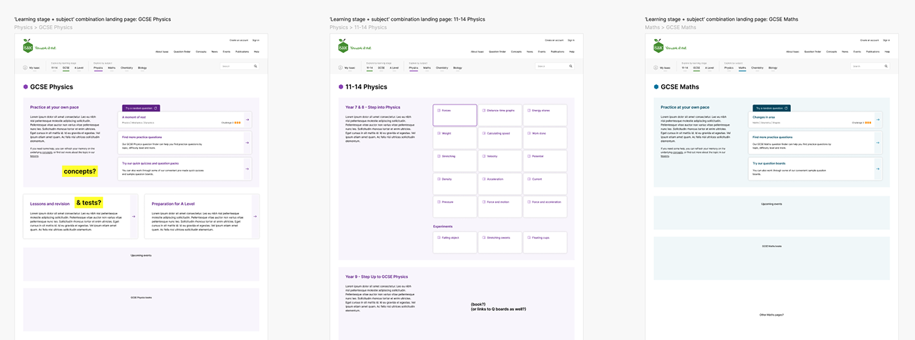
Learning stage + subject: a key concept to hold users within their context
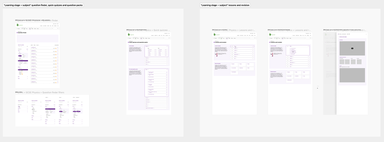
As the original platform evolved to support multi-subject and multi-stage content, its feature-driven interface still treated subject and learning stage as filters to be reapplied on every visit.
I proposed that we create a permanent space for each combination of learning stage + subject (eg GCSE Chemistry), with the core features present in each space, but already filtered to only deliver the relevant content for that context. This allows the platform to hold people in a context that matches the way they frame their work, without distraction or unnecessary interactions. It also accommodates variability in the type and scope of content available for each combination.
A dual-navigation approach that supports different information-seeking behaviours
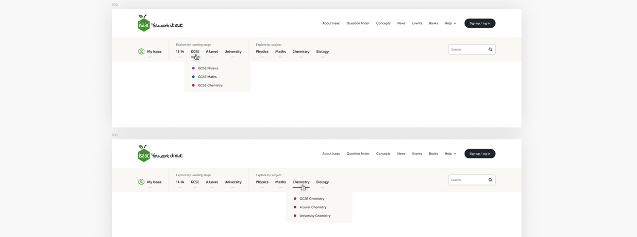
Students tend to shift between subjects at the same learning stage; teachers tend to be more subject-focused and switch between learning stages according to the class they’re teaching. I designed an intuitive and persistent dual-navigation device that allowed users to navigate to content whichever way felt most useful or natural, either by learning stage or by subject, landing at the same combined destination whichever route they chose.
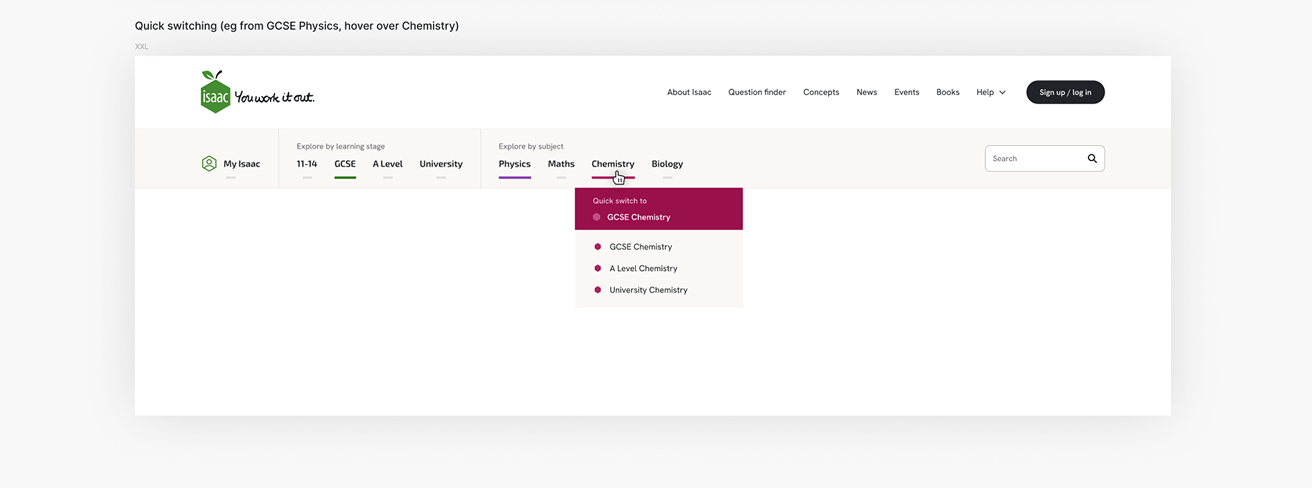
In the subject and learning stage navigation dropdowns, I also added ‘quick switch’ items to facilitate easy navigation to the most likely option that users would want next, based on their current context.
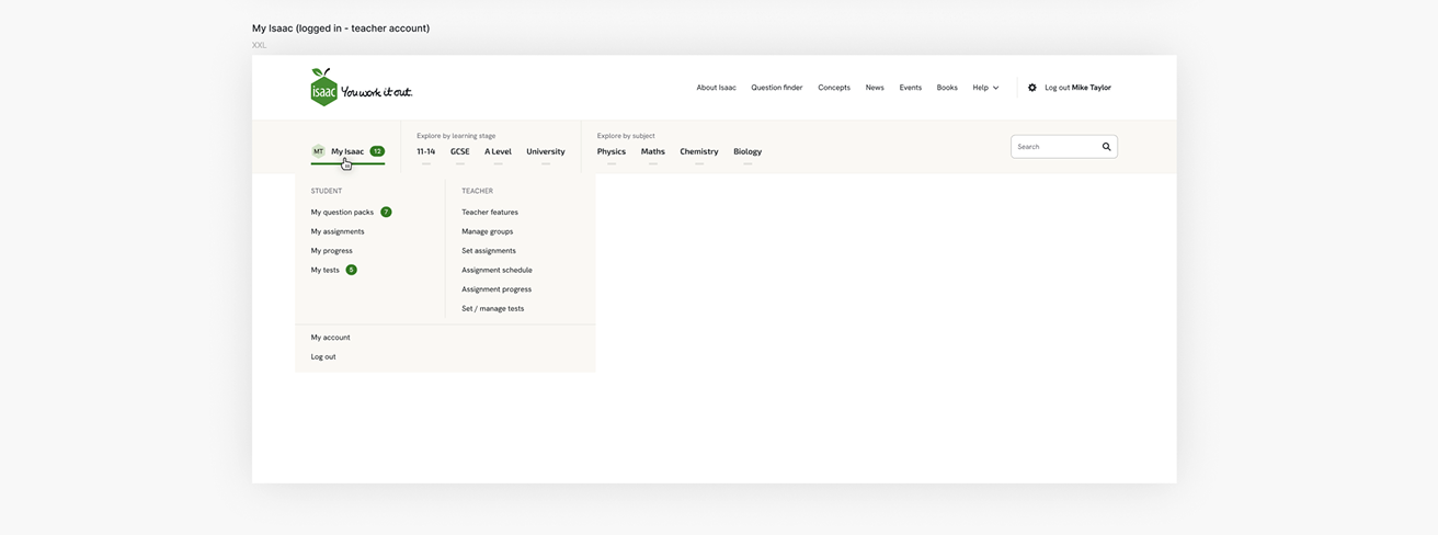
This dedicated navigation bar also provided a natural home for a combined “My Isaac” menu, giving students and teachers quick access to their most relevant information, activities and assignments.
Creating a consistent but flexible layout for a smoother and more intuitive experience
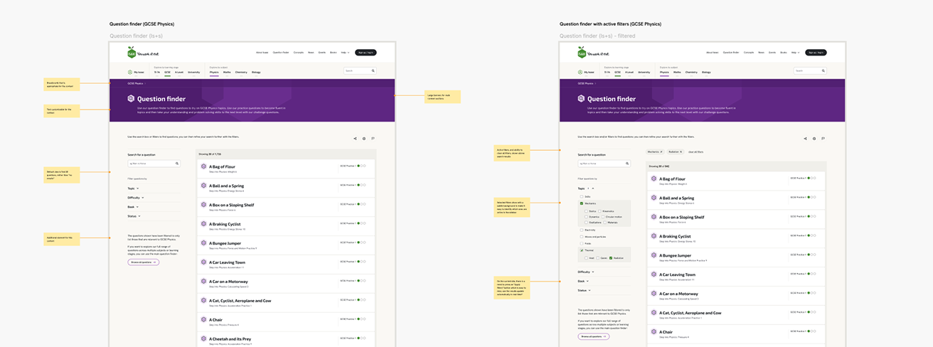
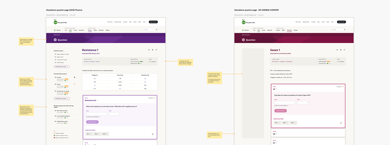
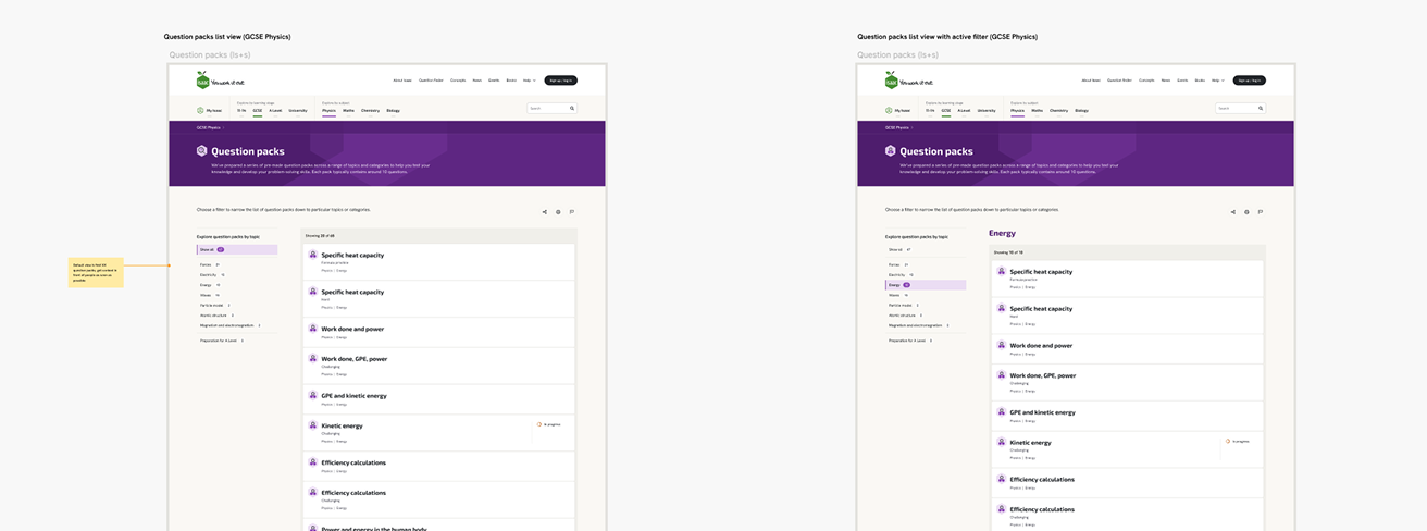
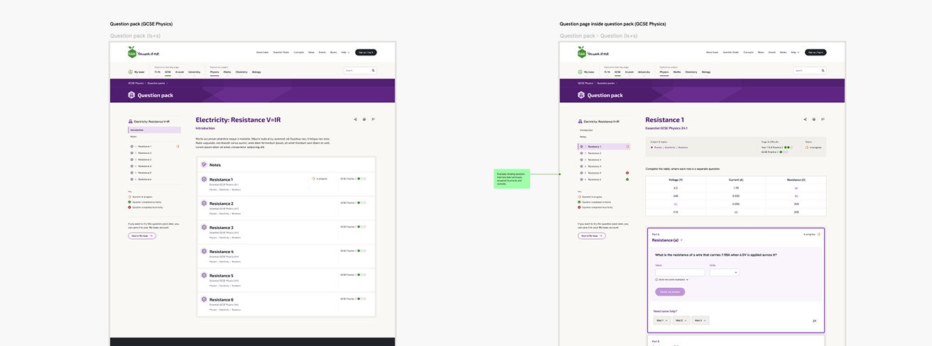
The previous single-column layout pushed content and supporting information out of sight, relying on accordions and inline tabs so that users had to hunt and expand to find what they needed. I introduced a consistent two-column layout that kept key content and navigation on screen at all times, giving every page a predictable structure and a clear visual hierarchy.
As well as consistency, the sidebar also provided the flexibility to be used in different ways depending on the type of page: in-context navigation, filtering, topic selection, or related links. Users learned the layout once and carried that understanding across the whole platform.
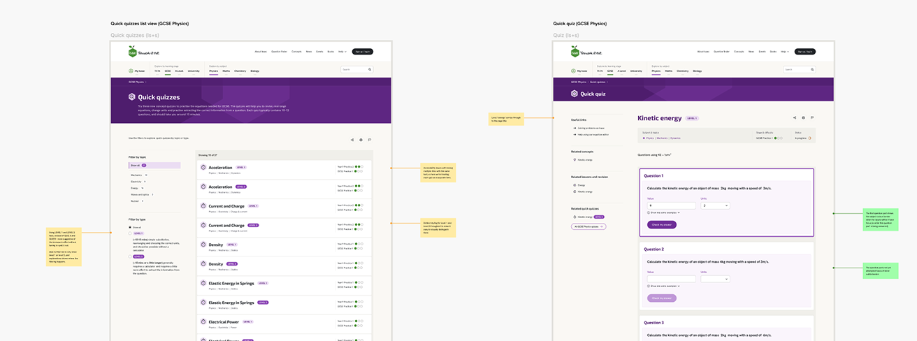
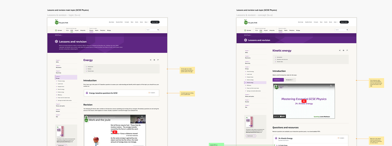
Seeking opportunities to provide greater value to students and teachers throughout the experience
Throughout the UX design thinking, I looked for opportunities to provide the most value for the user at any given moment. Some examples include:
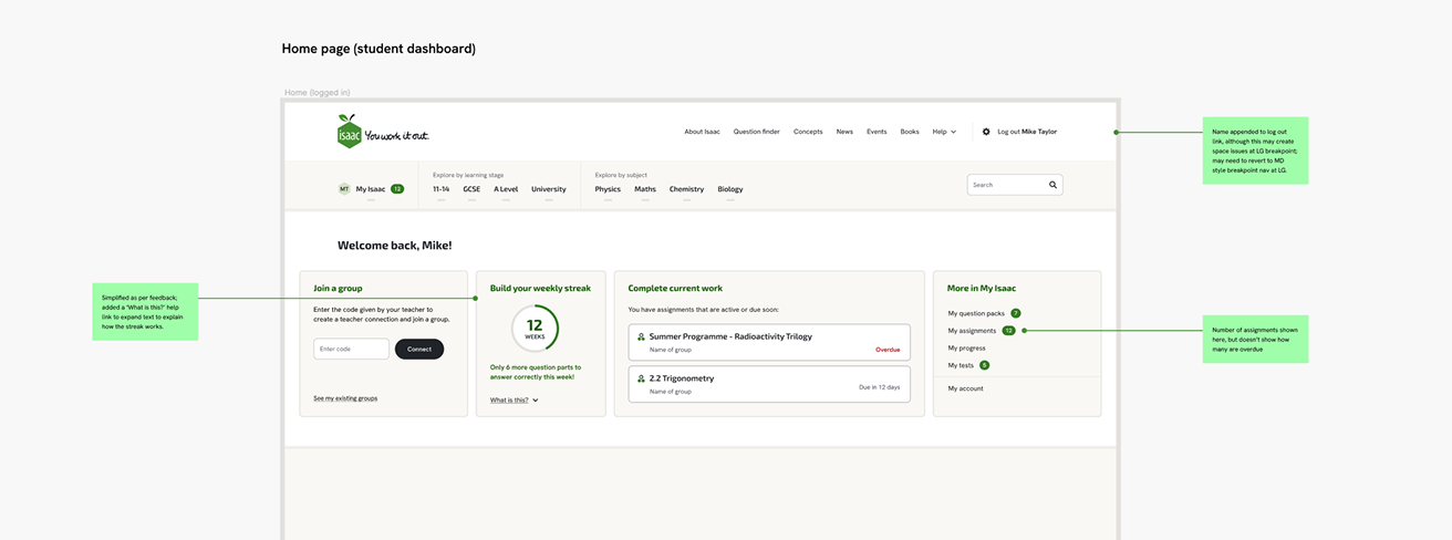
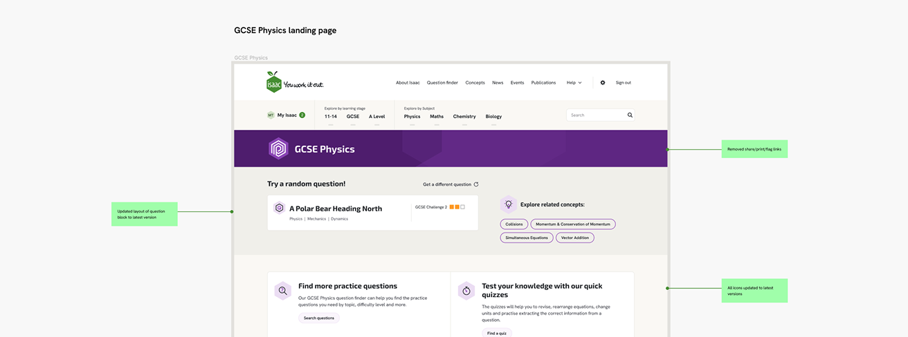
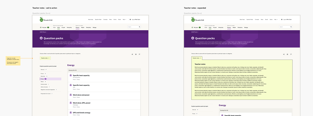
Challenging accepted wisdom: de-gamification to respect how students actually relate to the work
The platform provides sets of questions that students can work through; these might be sets that a teacher assigns, or topic-based sets a student can work through on their own. These were originally labelled “game boards”, but during the initial IA review, I recommended renaming these to “question packs”, swapping playful game-like language for plain language that clearly describes what they are.
This appears to be in contradiction to accepted thinking about using gamification to encourage uptake of a platform like this, but the fit didn’t feel right here.
Isaac’s users fall into two groups, and a game-like label sits awkwardly with both. For driven, self-directed learners, dressing up something they already find interesting can be reductive, undermining their motivation rather than boosting it. For the majority, working through questions their teacher has set, calling it a game doesn’t change the reality and risks feeling forced or a little patronising. A clear, honest label works better for both.
Covering the full discovery-to-handoff project lifecycle
I owned the UX thread from the first discovery work right through to developer handoff and beyond: a single point of continuity across discovery, specification, strategic thinking and direction, and production of the final screens.
Throughout, I worked directly and productively with the client and the technical team, and closed the engagement with a thorough handoff to the developers, staying available for any queries that followed during their implementation.